
Creating an attractive and strategic website for a small business to attract customers to physical stores requires careful planning and design. Below is a reflective account of the journey:
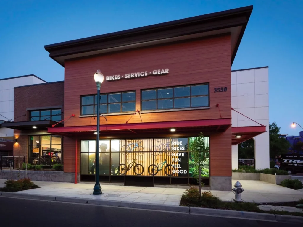
I conducted an extensive examination of the business’s identity as per the project brief of Small Business Website: Spokes & Saddles and offerings as my first priority. Building the brand’s character, values, and the products and reapir services provides established the basis for the visual and written components of the website. This initial research phase played a vital role in ensuring that the website would accurately represent the business.
Next, my focus shifted towards the design the user experience (UX). The main objective was to encourage in-store, which required the website to be user-friendly, captivating, and seamlessly guide users from their online exploration to taking action offline. To enhance the overall journey of the users, we prioritized incorporating clear navigation, prominent calls-to-action, and an aesthetically pleasing layout.
When it came to the visual appearance of the website, I chose a design that reflected the brand’s identity while maintaining a modern and uncluttered look. I carefully selected the color scheme and imagery to create a sense of the in-store atmosphere and offer users a visual glimpse of what they can expect. Consistency in branding elements, such as the logo and typography, played a crucial role in reinforcing brand recognition.
Integrating principles of mobile first responsive design was an essential requirement to ensure a seamless user experience across different devices. With the growing prevalence of mobile browsing, it was crucial for the website to perform flawlessly on smartphones and tablets, while maintaining its visual appeal and functionality regardless of screen size.
The effective use of high-quality and visually appealing images played a vital role in capturing the true essence of the business. Credit should be given to Trek.com for providing the outstanding images used in this project. We achieved a balance between informative content and captivating visuals to offer users both valuable information and an aesthetically pleasing experience. Each element, including product images and store interiors, aimed to spark curiosity and generate interest.
Strategically incorporating calls-to-action that encourage users to visit the physical store played a critical role in the design process. Whether it was through captivating banners, exclusive in-store offers, or a dedicated ‘Visit Us’ section, every aspect of the website was carefully crafted to motivate users to transition from online engagement to face-to-face interaction.
Throughout the design process, usability testing became an ongoing practice. Actively seeking feedback from potential users and continuously making improvements based on their insights ensured that the final design would truly resonate with the intended audience.
Upon reflection, the process of designing this website for a small business was a transformative journey. It involved harmoniously blending the visual appeal and functionality of the digital representation with a deep understanding of the brand and its customers. The resulting website not only serves as a virtual gateway but also entices customers to physically engage with the business. This successful fusion of digital and in-person

Leave a Reply